Infrastructure is an important part of society, whether it's developing new housing for people, reinforcing existing structures such as roads, or protecting ecosystems from problems such as erosion or floods. As such, contractors require a steady flow of high-quality and reliable geosynthetic materials in order to ensure that the structures they construct are stable and able to withstand environmental issues. But with many suppliers, how did we brand NovaGgeo to be the recognizable name as a geosynthetic solutions supplier across Asia?


Brand Identity
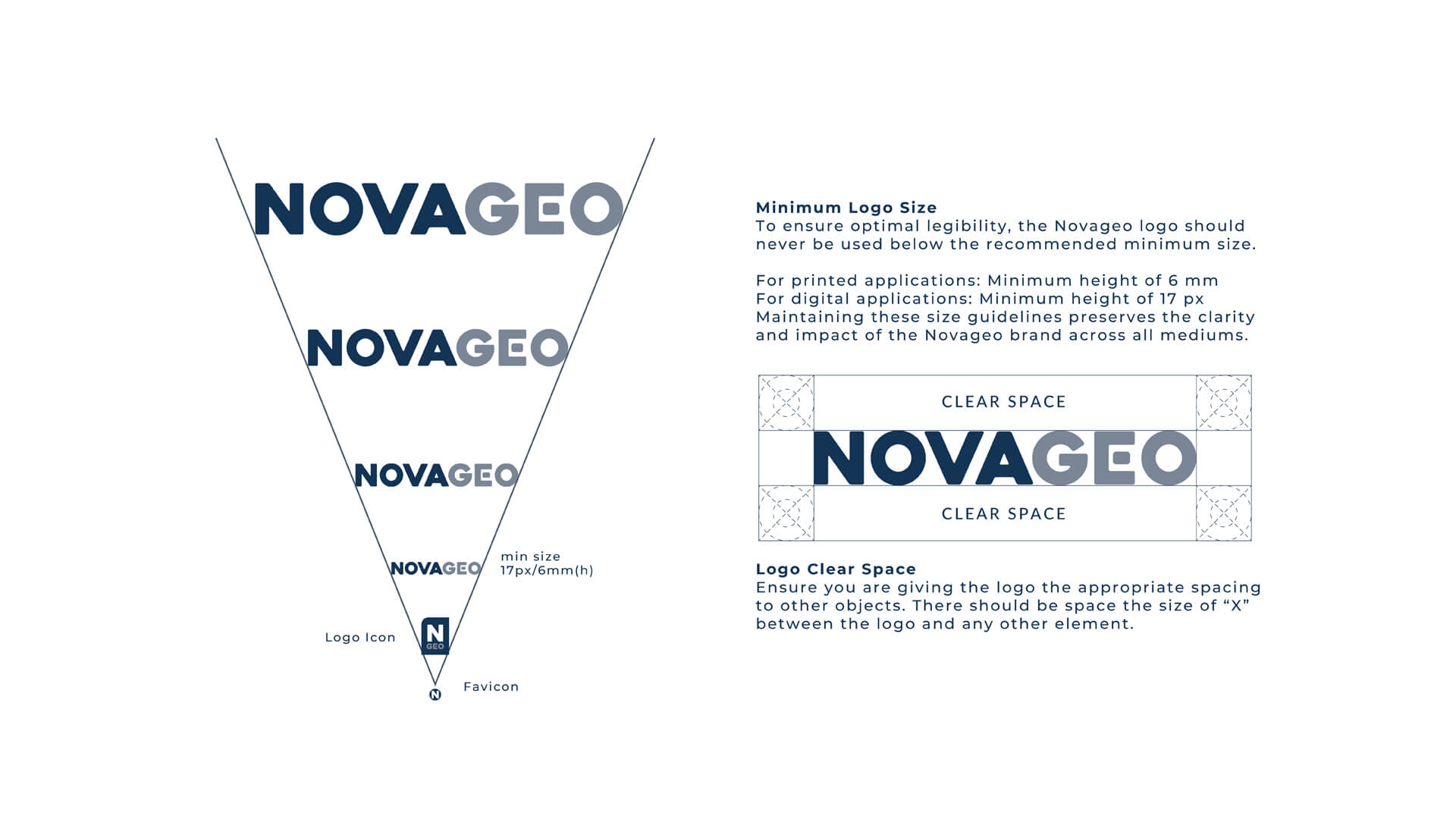
The Logo
The NovaGeo logo was designed to be legible and easy to identify by consumers. The color of the brand maintains its legibility, and will regularly incorporate two colors, which are blue and grey, and this makes it easy for brand recognition,
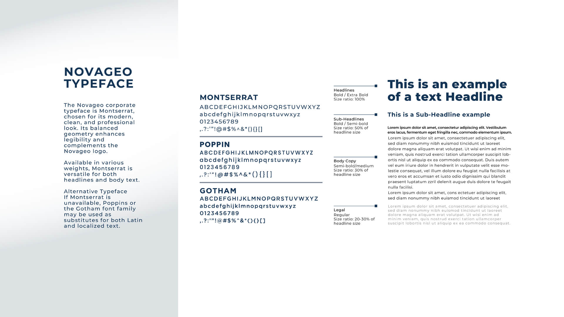
The Typeface
The chosen typeface for NovaGeo was Montserrat, as it reflected the brand's ideals of modern innovation, simplicity in its solutions, and professional look. Furthermore, the geometry of the text makes it easily legible and complements the NovaGeo logo.
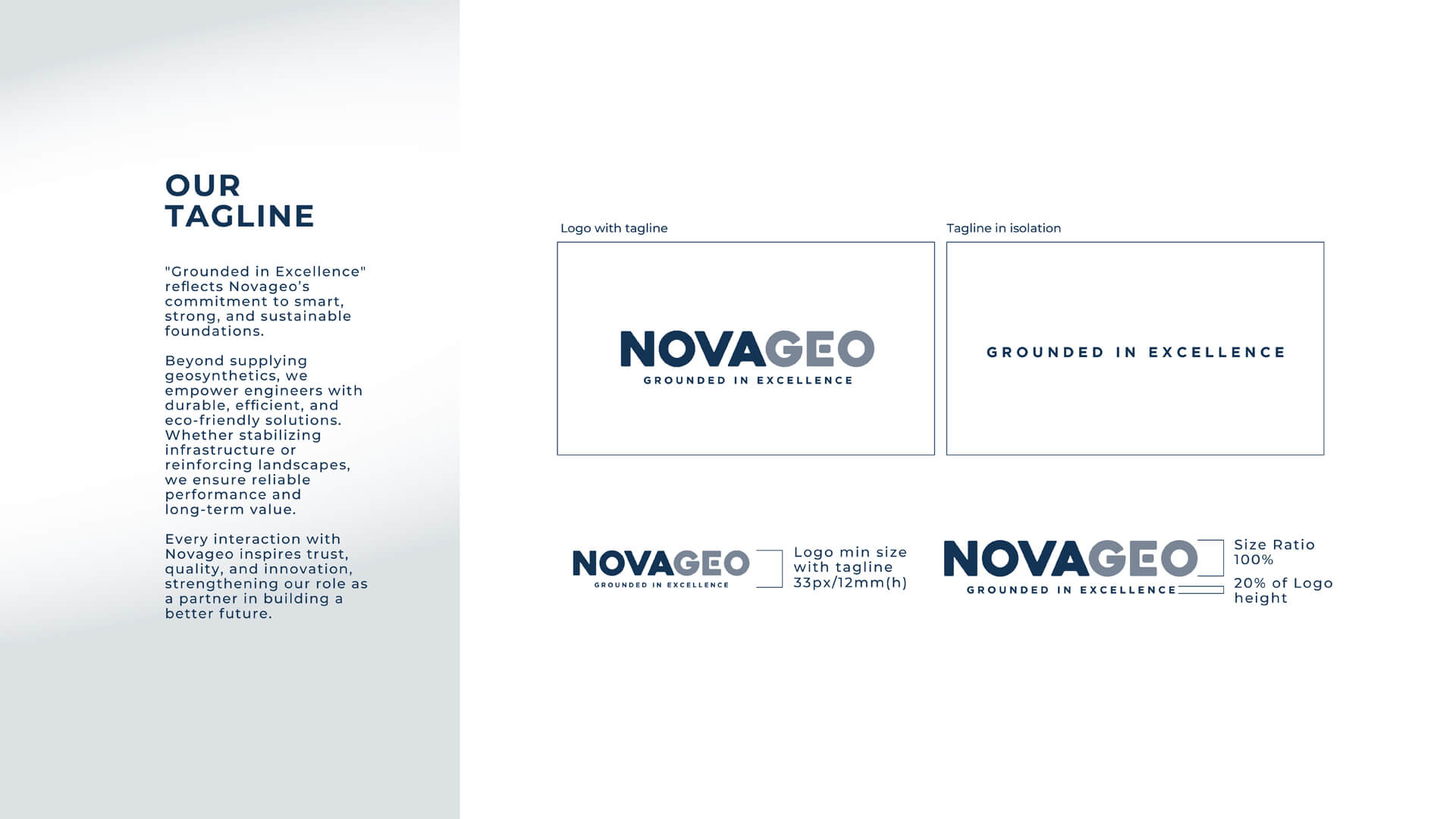
The Tagline
'Grounded in Excellence' is the tagline we've developed for NovaGeo, reflecting the brand's commitment to smart, strong, and sustainable foundations. It also reflects their commitment to empowering engineers with durable, efficient, and eco-friendly solutions.


